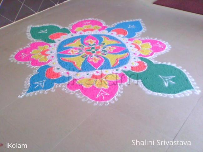
Rangoli done in Office
About Rangoli done in Office : PRINT
This Rangoli was made on day before diwali at our office , me & my freind Freda , we both have done this. Not very perfect both r immature.


This Rangoli was made on day before diwali at our office , me & my freind Freda , we both have done this. Not very perfect both r immature.


Comments
vijaysowmya
Sun, 2010-11-28 23:46
Permalink
your rangoli has come out really well...nice colours used...congrats to you and to your friend...
kameswari
Mon, 2010-11-29 00:51
Permalink
Very nice rangoli with good colour comibnation.
veena manigandan
Mon, 2010-11-29 01:02
Permalink
Nice, looking good!
ammuchandhini
Mon, 2010-11-29 01:50
Permalink
Bright and beautiful rangoli....after finishing d rangoli u could've redone d outlines with white kolam pdr...that would've given an even better look...
lakshmiraghu
Mon, 2010-11-29 01:51
Permalink
Very beautiful rangoli with good colour comibnation.
indu.rkc
Mon, 2010-11-29 02:48
Permalink
both have done very well
Vinci
Mon, 2010-11-29 02:52
Permalink
Lovely rangoli Shalini, I feel the spreading of colors isn't uniform, but that too looks good.. Any matching dark shade into your rangoli might have changed the mood.. Nice to see your upload after your Radha Krishna rangoli.
jayamohan
Mon, 2010-11-29 05:38
Permalink
Good attempt. Try more!
jasree
Mon, 2010-11-29 08:11
Permalink
Very Nice Rangoli with beautiful colour combination
Lata
Mon, 2010-11-29 19:05
Permalink
Looks pretty Shalini! The green structure at the right appears to be a little bit elongated, but the whole rangoli with pleasing colors looks beautiful.
rajamma_2
Mon, 2010-11-29 21:19
Permalink
Nice design, pleasing colors used . u both have done good job. ( while drawing free hand design u can put dots at the proper places to get perfect symmetry )
rajamma
rajamma_2
Mon, 2010-11-29 21:19
Permalink
rajamma
dibbutn
Wed, 2010-12-01 05:58
Permalink
Such a cute rangoli with lovely colors. Apart from the right green pattern being a little bigger than the rest, I feel the entire kolam is well done.
smahalakshmi
Sun, 2010-12-05 02:30
Permalink
Nice Rangoli. Had u reduced the size of the right most green portion, you would have got a perfect symmetry.
Mahalakshmi
judelined
Fri, 2010-12-10 03:03
Permalink
Again Brindha's design?? Am I seeing right?? Bold colours - if only the symmetry was ok then this would have been a good creation