Notebook Rangoli
About Notebook Rangoli : PRINT
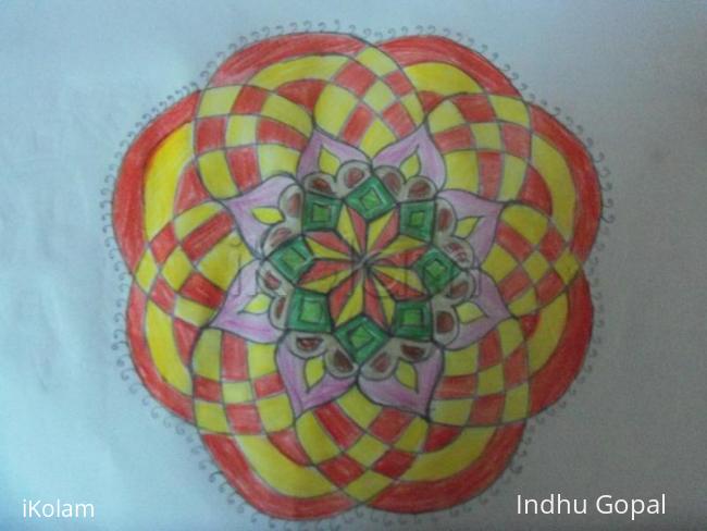
Yet another notebook kolam done by me and coloured with coloring pencils, your comments please.

Yet another notebook kolam done by me and coloured with coloring pencils, your comments please.

Comments
judelined
Fri, 2010-08-27 21:37
Permalink
Pretty design Indhu, but I feel the outside red and yellow is too dominating thus swallowing the attention of the inside design. You should have split the colouring of the outside in two sections which I am sure would have been much better. The overall design is pretty though
Vinci
Fri, 2010-08-27 21:57
Permalink
Nice design.. Thanks for giving us in colors...
Padma Prakash
Fri, 2010-08-27 23:39
Permalink
very nice design and good colouring. Next time take care of the symmetry.
dibbutn
Sat, 2010-08-28 20:37
Permalink
Nice design
toindhu
Sun, 2010-08-29 00:02
Permalink
Actuallu judy It is meant to be like weaving of a basket(one layer overlapping the other). Thats y i used the same color. may be i should ve used some thing like pink and blue instead of red and yellow. anywys thank you for your suggession.
rajamma_2
Mon, 2010-08-30 02:20
Permalink
Nice design . but I think the color choice made it look like two different kolams merged. Just try the same kolam with suitable color combination and see.l.rajamma
brindhanagesh
Tue, 2010-08-31 02:11
Permalink
beautiful design.