Collage- 3
About Collage- 3 : PRINT
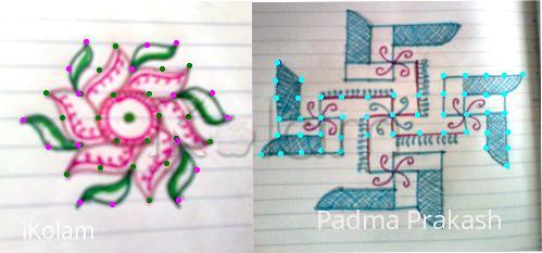
This is a collage of Flower and Swastik Kolam. The rangoli's are drawn using pencil and coloured using sketch pens. The dot count is visible. One image is quite blurr. Hope u all accept n....._________.


Comments
meena@ikolam.com
Mon, 2010-07-12 23:40
Permalink
very attractive kolam.Nnice colour combination you used in these kolams.My favourite colour is blue that's why i like the second kolam very much..................................
rajamma_2
Tue, 2010-07-13 02:23
Permalink
Padma,Both r nice. first one pink/green combination very good. looks like a flag kolam also.Second one is different kind, swastiks and flowers nicely blended. The florescent neel dots add the beauty .... but why they r in only one direction?
rajamma
alameluranganath
Tue, 2010-07-13 03:19
Permalink
very nice designs
Rajusree
Tue, 2010-07-13 07:36
Permalink
Both the designs r very cute.
ammuchandhini
Tue, 2010-07-13 18:56
Permalink
hai padma mam...both ur kolams r beautiful...esp i liked d second one very much...
sudhabalakrishnan
Tue, 2010-07-13 21:08
Permalink
hi, padma, both the kolams are really very neatly drawn and superb too. I liked the first one very much, the colours used are really good
dibbutn
Tue, 2010-07-13 22:34
Permalink
Padma maam cute kolams... the first one with good color combination
lakshmiraghu
Tue, 2010-07-13 22:34
Permalink
padma both the rangavallis are very very nice...
brindhanagesh
Wed, 2010-07-14 02:47
Permalink
Both the kolams are nice with good colour combinations.
Lata
Wed, 2010-07-14 12:18
Permalink
Both the rangolis are beautiful. The colors that you've chosen further enhance the beauty, in both the designs. Wish you could've kept both a separate files, since they have different set of dots.
jkmrao
Fri, 2010-07-16 09:20
Permalink
Pretty designs. I too feel these must have been separately uploaded and that too in larger size.
Regards! - mOhana
judelined
Fri, 2010-07-23 02:35
Permalink
Very pretty Padma - both are very attractive
Padma Prakash
Thu, 2010-07-29 02:15
Permalink
Thank you all