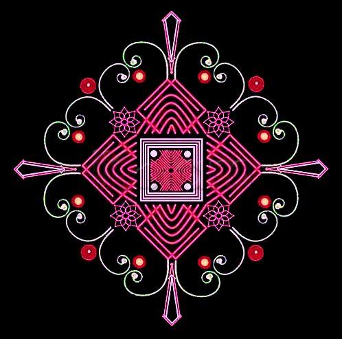
The neon lines are looking very good. Nice tear drop shapes with sharp edges - a nice little pattern to use here and there. I especially like how the four flowers have been used along the corners of the nested squares.
Oh, and a nice ambigram gold lettering at the top left. :)
mOhanaji the center part reminds me woolen cloth...the pink goes very good with background.

Uncle nice one I like the woolen thread design.
excellent sir, once again it is nice

Mohanaji, your way of making kolams is different and very nice. I like the outer square and the small flowers very much. THe surrounding bindis add more beauty to this kolam.
Nice one Mohana sir... I liked the floral design and the center design a lot

inner padikolam design is looking nice and different.
for me the outer chuzhis, one big one small look like meetings of some love birds!